
6 min read
We removed the habits that make a site look machine-made, and kept the brand
We reviewed lightoflife.work for the habits common to machine-made pages and fixed them. Here is what we changed, what we kept on purpose, and the numbers.
- Design
- Hallmark
- Website
- Operations
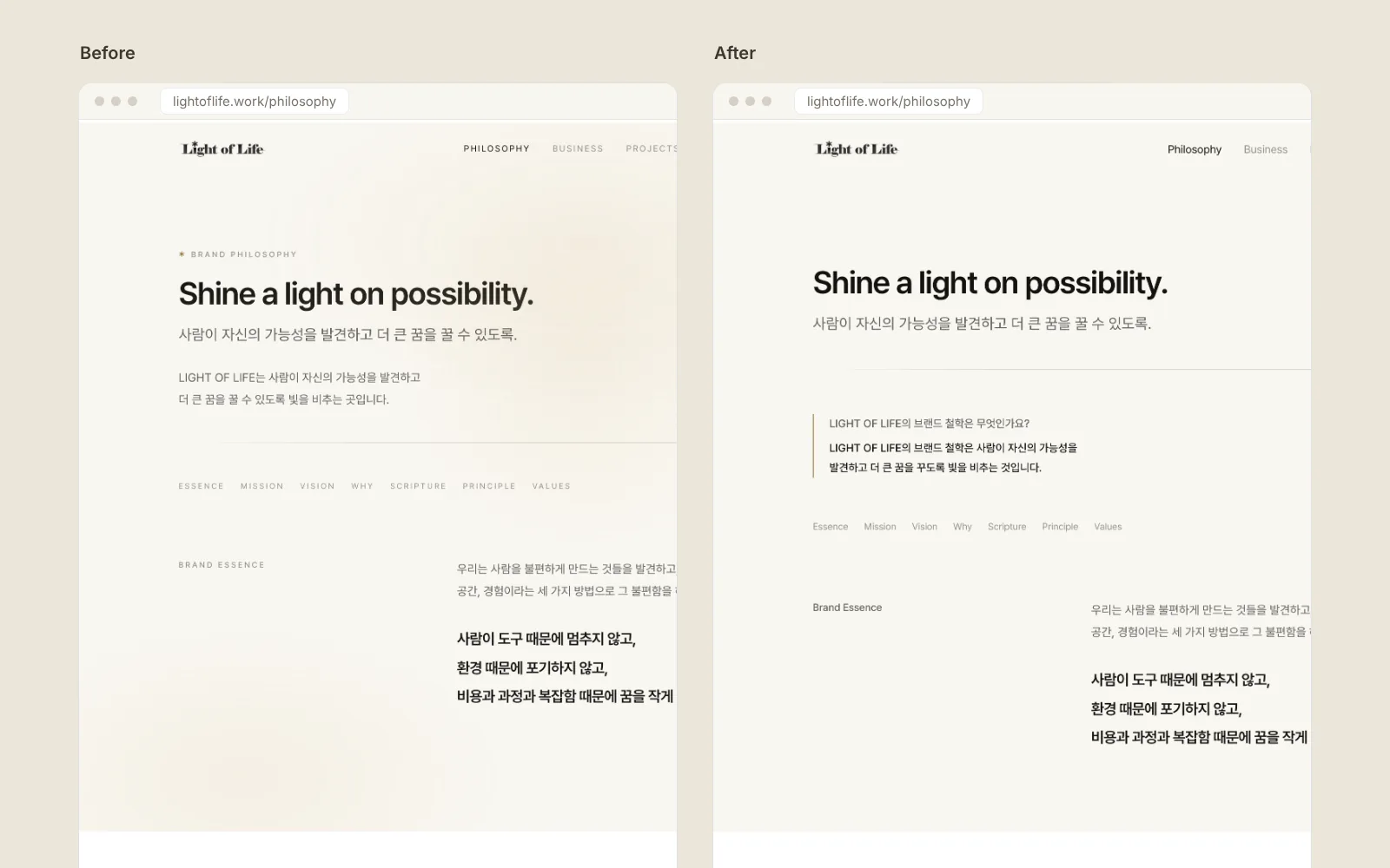
The question behind this post
What should you fix so a website does not look like AI made it?
These days many web pages feel AI-made at first glance. Not because the content is bad, but because the same habits repeat across site after site.
Ours was no exception. So we went through lightoflife.work from the top and fixed those habits one by one, using the criteria of Hallmark (github.com/Nutlope/hallmark), an open design checklist.
What we counted as a tell
Hallmark lists the patterns that show up again and again on machine-made pages. These are the ones our site actually had.
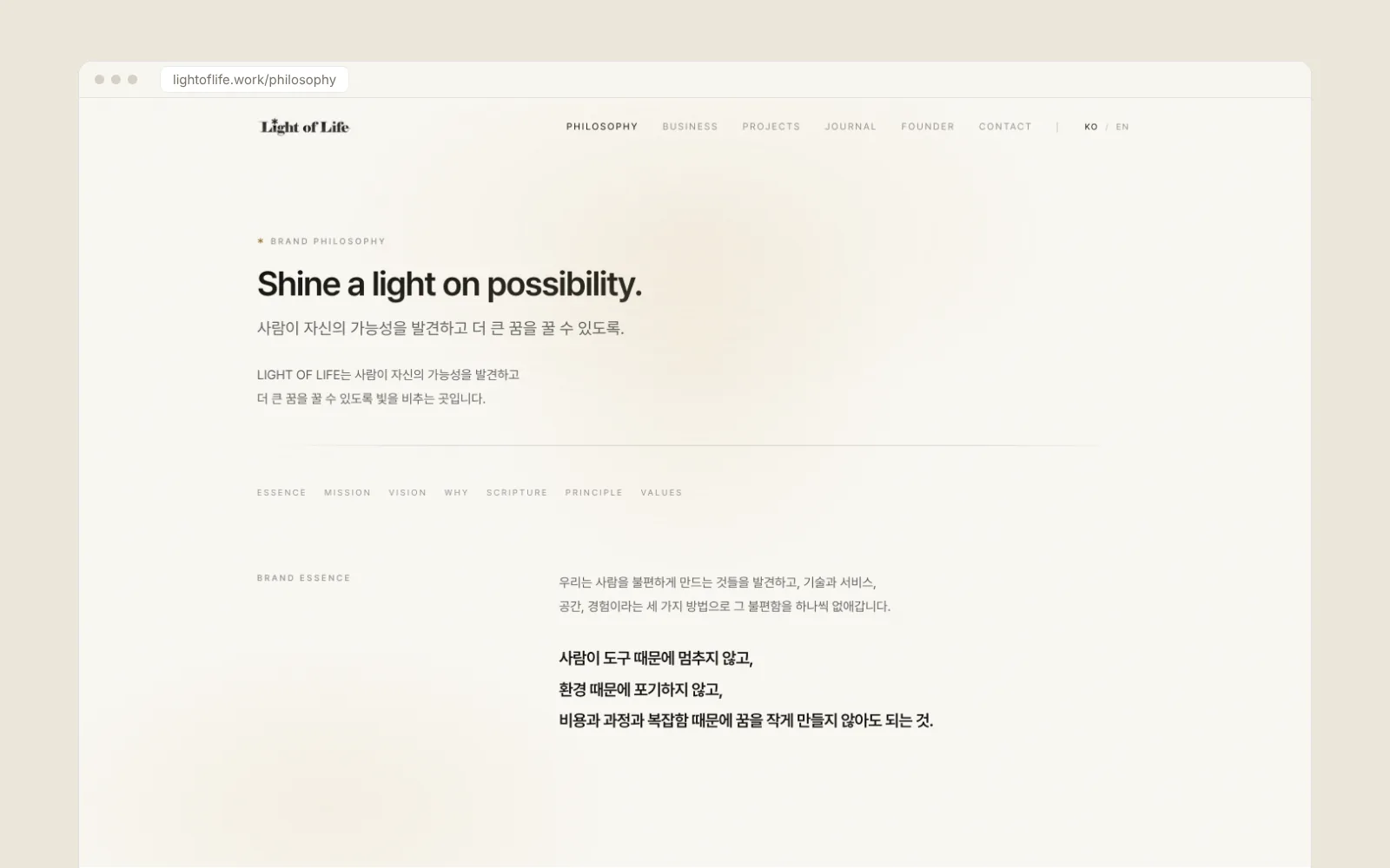
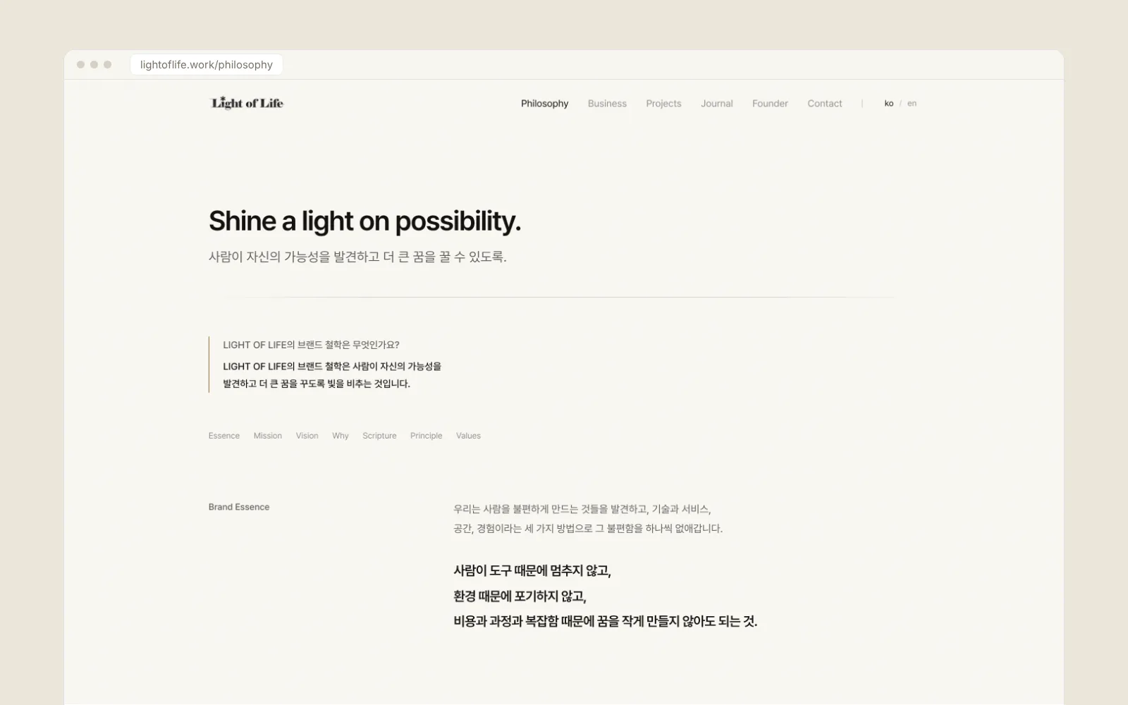
- Eyebrows: small English labels above headings, such as “WHY WE BUILD” or “OUR PRINCIPLE”, repeating what the heading already says.
- Tracked uppercase labels: 10 to 12 px text set in capitals with wide letter spacing.
- Lists joined with middle dots (“A · B · C”) and arrows glued to button text (“Contact →”).
- Headings painted with gradient text.
- Glow blobs spread across the whole page with nothing in them.
- Images that zoom on hover.
- transition-all, with no decision about which property should move.
The numbers
Across 22 built pages we found 66 eyebrows. The first pass brought that to 4, the second to 0. Uppercase labels, middle-dot lists, and glued arrows all went to 0.
Static lint failures dropped from 337 to 75, then to 49. Most of what remains are false positives from the linter not reading our external CSS file.
We checked the screen, not just the source
Reading code misses things. So we opened every page in a real browser and checked what was actually rendered. In that check, failures went from 12 to 2.
The rendered check also found new problems. Subpage heroes stacked five blocks of text, and one sentence appeared twice as both answer and lead. A status badge had a 4.24:1 contrast ratio, short of 4.5:1, and the contact form fields had almost invisible borders. We fixed all of them.
What we kept on purpose
Not everything the checklist flagged was removed. Some things had a reason to stay.
- The en dash in the scripture reference (Matthew 5:14–16). It is the convention for a verse range.
- The beam of light on the home hero. It is the scene our name describes, so we removed the glow from every other page and kept it only here.
Fix the reflex, keep the brand. That one line was the rule for this cleanup.
Using the same rule next time
Habits creep back in when you build a new page. So we kept the same checks ready to run on the next change, and every new post has to pass them before it goes up.